pacman::p_load(ggdist, ggridges, ggthemes, colorspace, tidyverse)Hands-on_Ex04 (1) - Visualising Distribution
1 Learning Outcome
Visualising distribution is not new in statistical analysis. In Session 1, there are some of the popular statustistical graphics methods for visualising distribution, such as histogram, probability density curve (pdf), boxplot, notch plot and violin plot, and how they can be created using ggplot2.
In this session, we will learn two relatively new statistical graphic methods for visualisaing distribution, namely ridgeline plot and raincloud plot using ggplot2 and its extensions.
2 Getting started
2.1 Installing and loading packages
The following R packages will be used for this exercise.
- ggridges: a ggplot2 extension specially designed for plotting ridgeline plots
- ggdist: a ggplot2 extension specially designed for visualising distribution and uncertainty.
- tidyverse: a family of R packages to meet the modern data science and visual communication needs
- ggthemes: a ggplot extension that provides the user additional themes, scales, and geoms for the ggplots package.
- colorspace: a R pckage provides a broad toolbox for selecting individual colours or colour palettes, manipulating these colours, and employing them in various kinds of visualisations.
The code chunk below will be used loading these R pakcages into RStudio environment.
2.2 Data import
For the purpose of this exercise, Exam_data.csv will be used.
In the code chunk below, read_csv() of readr package is used to import Exam_data.csv into R and saved it into a tibble data.frame.
exam <- read_csv("data/Exam_data.csv")3 Visualising Distribution with Ridgeline Plot
Ridgeline plot (sometimes called Joyplot) is a data visualisation technique for revealing the distribution of a numeric value for several groups. Distribution can be represented using histograms or density plots, all aligned to the same horizontal scale and presented with a slight overlap.
❓ WHAT FOR
Ridgeline plots make sense when the number of group to represent is
medium to high, and thus a classic window separation would take to much space. Indeed, the fact that groups overlap each other allows to use space more efficiently. If you have less than ~6 groups, dealing with other distribution plots is probably better.It works well when there is a clear pattern in the result, like if there is an obvious ranking in groups. Otherwise group will tend to overlap each other, leading to a messy plot not providing any insight.
Figure below is a ridgelines plot showing the distribution of English scores by class.
Show the code
ggplot(exam,
       aes(x = ENGLISH,
           y = CLASS)) +
  geom_density_ridges(
    scale = 3,
    rel_min_height = 0.01,
    bandwidth = 2.5,
  ) +
  scale_x_continuous(
    name = "English grades",
    expand = c(0,0),
  ) +
  scale_y_discrete(name = "Class", expand = expansion(add=c(0.2, 2.6))) +
  theme_ridges()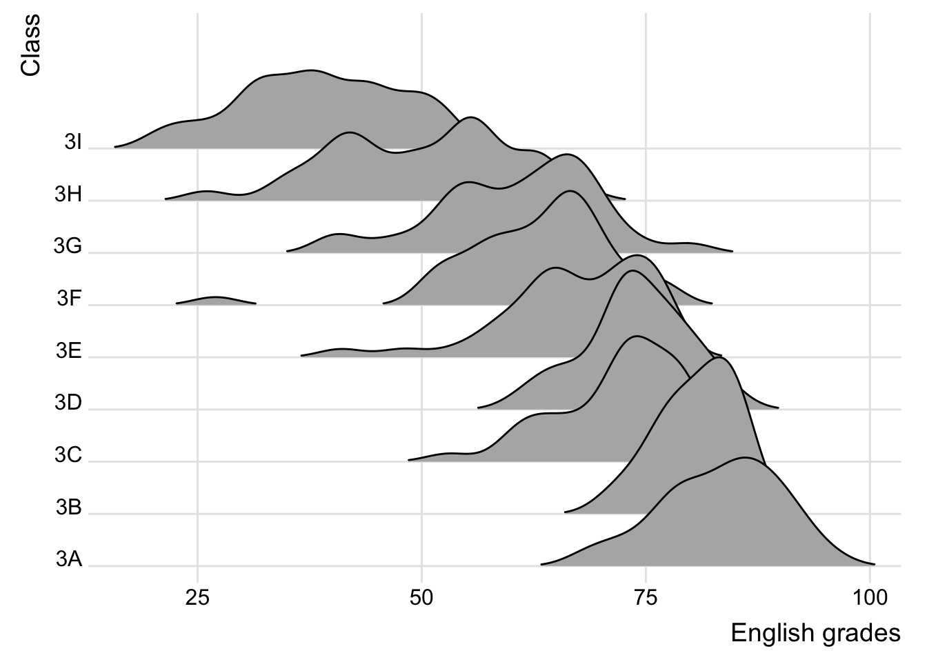
3.1 Plotting ridgeline graph: ggridges method
There are several ways to plot ridgeline plot with R. In this section, we will learn how to plot ridgeline plot by using ggridges package.
ggridges package provides two main geom to plot ridgeline plots. They are:
grom_ridgeline() and geom_density_ridges(). The former takes height values directly to draw the ridgelines, and the latter first estimates data densities and then draws those using ridgelines.
The ridgeline plot below is plotted by using geom_density_ridges().
Changed colour fill, opacity, no grid lines and scale.
Show the code
ggplot(exam,
       aes(x = ENGLISH,
           y = CLASS)) +
  geom_density_ridges(
    scale = 5,
    rel_min_height = 0.01,
    bandwidth = 3.4,
    fill = lighten("pink", 0.5),
    color = "#7097BB"
  ) +
  scale_x_continuous(
    name = "English grades",
    expand = c(0,0),
  ) +
  scale_y_discrete(name = "Class", expand = expansion(add=c(0.2, 2.6))) +
  theme_ridges(grid = FALSE)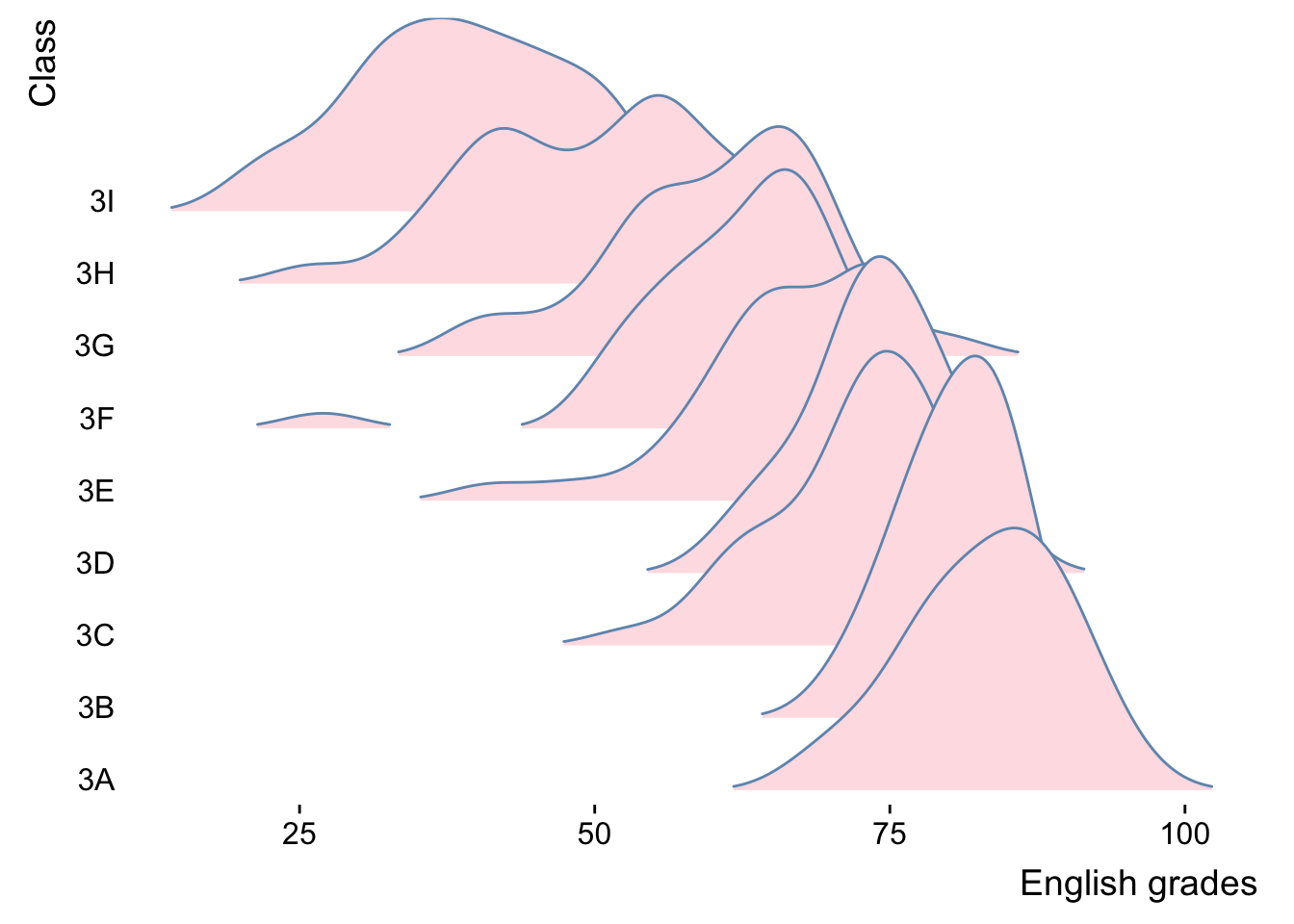
Show the code
ggplot(exam,
       aes(x = ENGLISH,
           y = CLASS)) +
  geom_density_ridges(
    scale = 3,
    rel_min_height = 0.01,
    bandwidth = 3.4,
    fill = lighten("#7097BB", .3),
    color = "white"
  ) +
  scale_x_continuous(
    name = "English grades",
    expand = c(0,0),
  ) +
  scale_y_discrete(name = NULL, expand = expansion(add=c(0.2, 2.6))) +
  theme_ridges()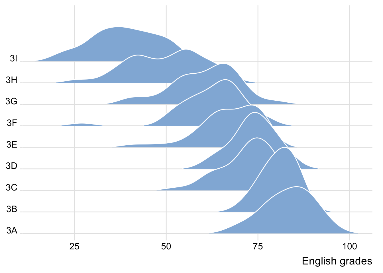
3.2 Verying fill colors along the x axis
Sometimes we would like to have the area under a ridgeline not filled with a single solid colour but rather with colours that vary in some form along the x axis. This effect can be achieved by using either geom_ridgeline_gradient() or geom_density_ridges_gradient().
Both geoms work just like geom_ridgeline() and geom_density_ridges()
Applied a different filling colour scheme.
Show the code
ggplot(exam,
       aes(x = ENGLISH,
           y = CLASS,
           fill = stat(x))) +
  geom_density_ridges_gradient(
    scale = 3,
    rel_min_height = 0.01) +
  scale_fill_viridis_c(name = "Temp. [F]",
                       option = "G") +
  scale_x_continuous(name = "English grades",
                     expand = c(0,0)
  ) +
  scale_y_discrete(name = NULL, expand = expansion(add = c(0.2, 2.6))) +
    theme_ridges()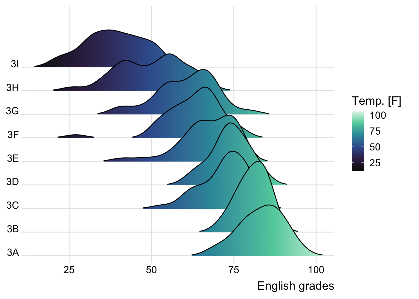
Show the code
ggplot(exam,
       aes(x = ENGLISH,
           y = CLASS,
           fill = stat(x))) +
  geom_density_ridges_gradient(
    scale = 3,
    rel_min_height = 0.01) +
  scale_fill_viridis_c(name = "Temp. [F]",
                       option = "C") +
  scale_x_continuous(name = "English grades",
                     expand = c(0,0)
  ) +
  scale_y_discrete(name = NULL, expand = expansion(add = c(0.2, 2.6))) +
    theme_ridges()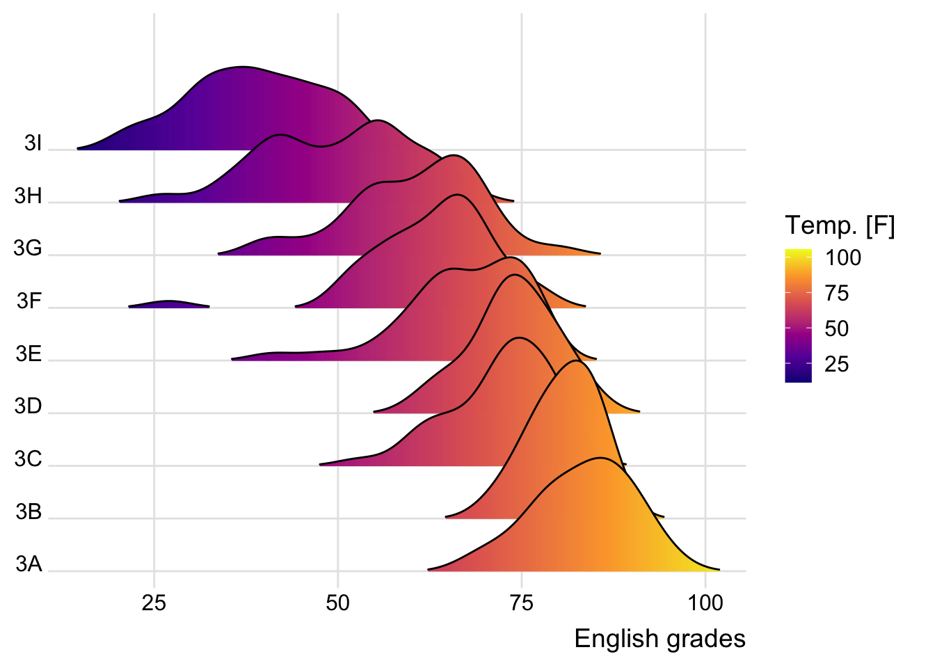
3.3 Mapping the probabilities directly onto color
Besides providing additional geom objects to support the need to plot ridgeline plot, ggridges package also provides a stat function called stat_density_ridges() that replaces stat_density() of ggplot2.
Figure below is plotted by mapping the probabilities calculated by using stat(ecdf) which represent the empirical cumulative density function for the distribution of English score.
Used scale_fill_viridis_b to replace scale_fill_viridis_c, and changed theme colour.
❓ Need discrete data to use scale_fill_viridis_d ? > see next example!
Show the code
ggplot(exam,
       aes(x = ENGLISH, y = CLASS,
           fill = 0.5 - abs(0.5-stat(ecdf)))) +
  stat_density_ridges(geom="density_ridges_gradient",
                      calc_ecdf = TRUE) +
  scale_fill_viridis_b(name = "Tail probability",
                       option = "B",
                       direction = -1) +
theme_ridges() 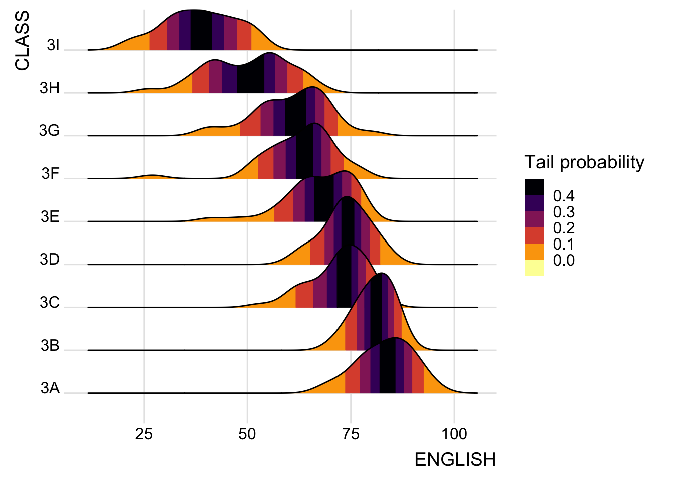
Show the code
ggplot(exam,
       aes(x = ENGLISH, y = CLASS,
           fill = 0.5 - abs(0.5-stat(ecdf)))) +
  stat_density_ridges(geom="density_ridges_gradient",
                      calc_ecdf = TRUE) +
  scale_fill_viridis_c(name = "Tail probability",
                       direction = -1) +
theme_ridges() 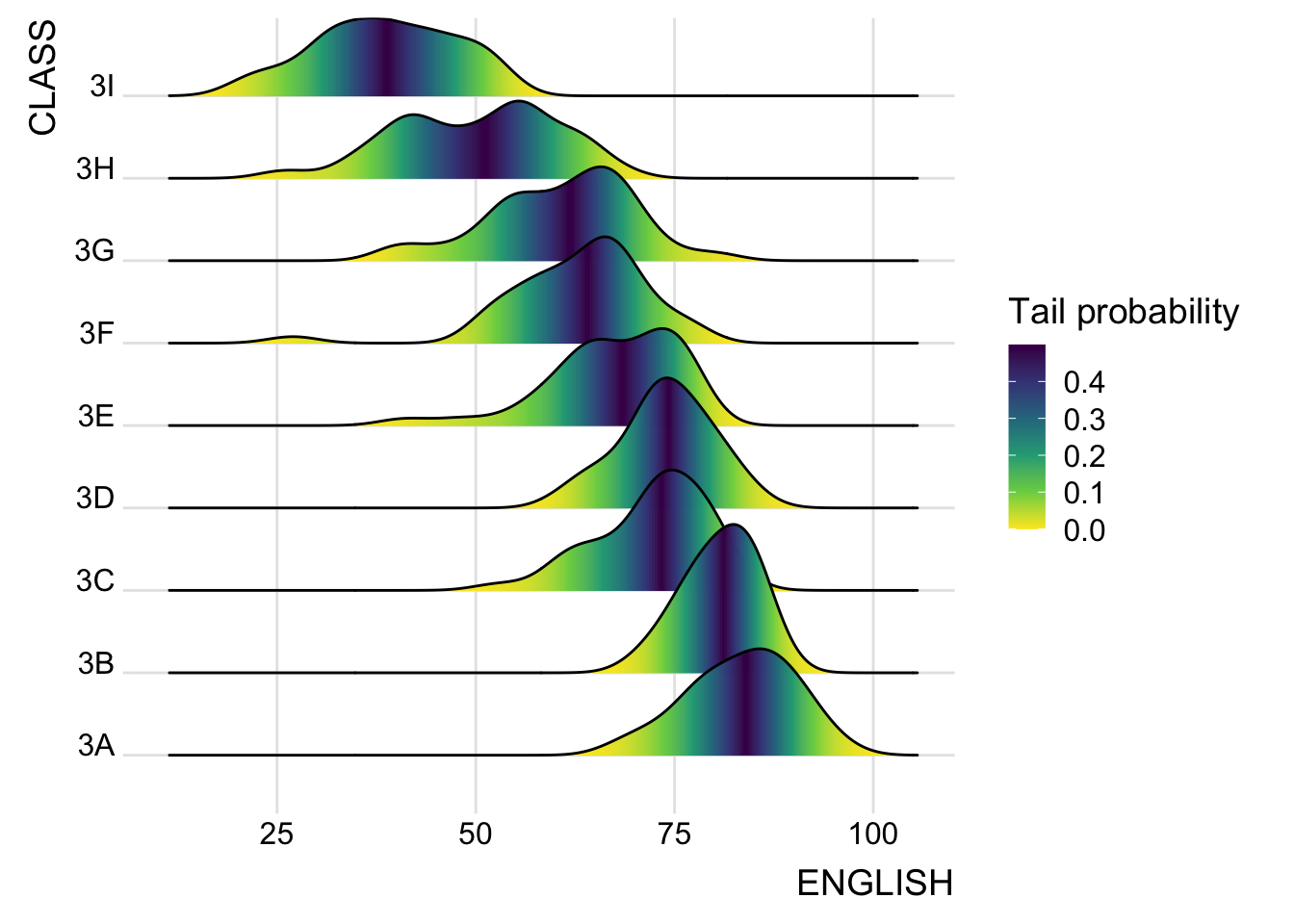
Important
It is important to include the argument calc_ecdf = TRUE in stat_density_ridges().
3.4 Ridgeline plots with quantile lines
By using geom_density_ridges_gradient(), we can colour the ridgeline plot by quantile, via the calculated stat(quantile) aesthetic as shown in the figure below.
Changed theme colours
Show the code
ggplot(exam,
       aes(x = ENGLISH,
           y = CLASS,
           fill = factor(stat(quantile)))) +
  stat_density_ridges(
    geom = "Density_ridges_gradient",
    calc_ecdf = TRUE,
    quantiles = 4,
    quantile_lines = TRUE) +
  scale_fill_viridis_d(name = "Quantiles",
                       option = "B") +
  theme_ridges()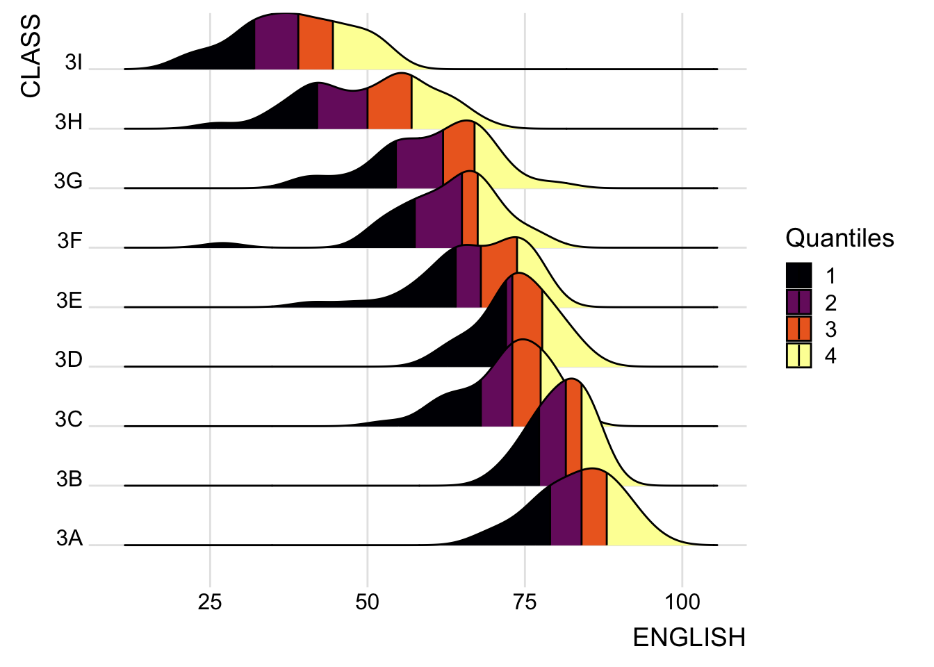
Show the code
ggplot(exam,
       aes(x = ENGLISH,
           y = CLASS,
           fill = factor(stat(quantile)))) +
  stat_density_ridges(
    geom = "Density_ridges_gradient",
    calc_ecdf = TRUE,
    quantiles = 4,
    quantile_lines = TRUE) +
  scale_fill_viridis_d(name = "Quantiles") +
  theme_ridges()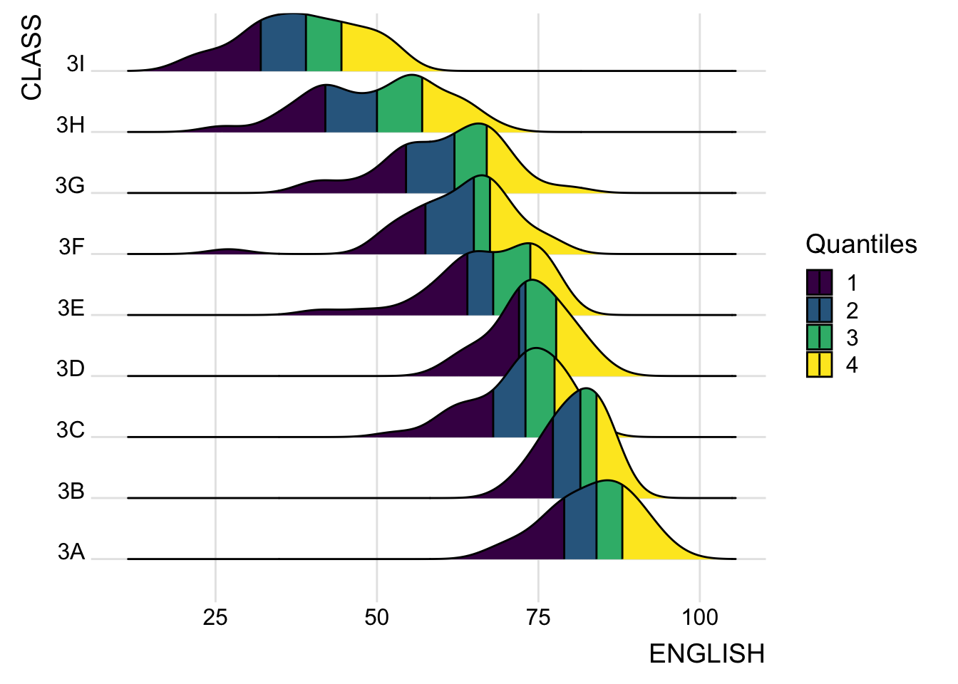
Instead of using number to define the quantiles, we can also specify quantiles by cutting points such as 2.5% and 97.5% tails to colour the ridgeline plot, shown in figure below.
📝 alpha in scale_fill_manual()
Changed colours fill
Show the code
ggplot(exam,
       aes(x = ENGLISH,
           y = CLASS,
           fill = factor(stat(quantile)))) +
  stat_density_ridges(
    geom = "density_ridges_gradient",
    calc_ecdf = TRUE,
    quantiles = c(0.025, 0.975)
  ) +
  scale_fill_manual(
    name = "Probability",
    values = alpha(c("#E76F51", "#FCEDA0", "#6AA68B"), 0.5),
    labels = c("(0, 0.025]", "(0.025, 0.975]", "(0.975, 1]")
  ) +
  theme_ridges()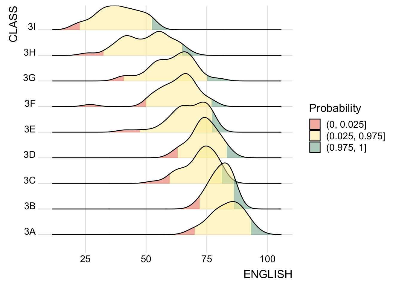
Show the code
ggplot(exam,
       aes(x = ENGLISH,
           y = CLASS,
           fill = factor(stat(quantile)))) +
  stat_density_ridges(
    geom = "density_ridges_gradient",
    calc_ecdf = TRUE,
    quantiles = c(0.025, 0.975)
  ) +
  scale_fill_manual(
    name = "Probability",
    values = c("#FF0000A0", "#A0A0A0A0", "#0000FFA0"),
    labels = c("(0, 0.025]", "(0.025, 0.975]", "(0.975, 1]")
  ) +
  theme_ridges()
4 Visualsing Distribution with Raincloud Plot
Raincloud Plot is a data visualisation techniques that produces a half-density to a distribution plot. It gets the name because the density plot is in the shape of a “raincloud”. The raincloud (half-density) plot enhances the traditional boxplot by highlighting multiple modalities (an indicator that groups may exist). The boxplot does not show where densities are clustered, but the raincloud plot does!
In this section, we will learn how to create a raincloud plot to visualise the distribution of English score by race. It will be created by using functions provided by ggdist and ggplot2 packages.
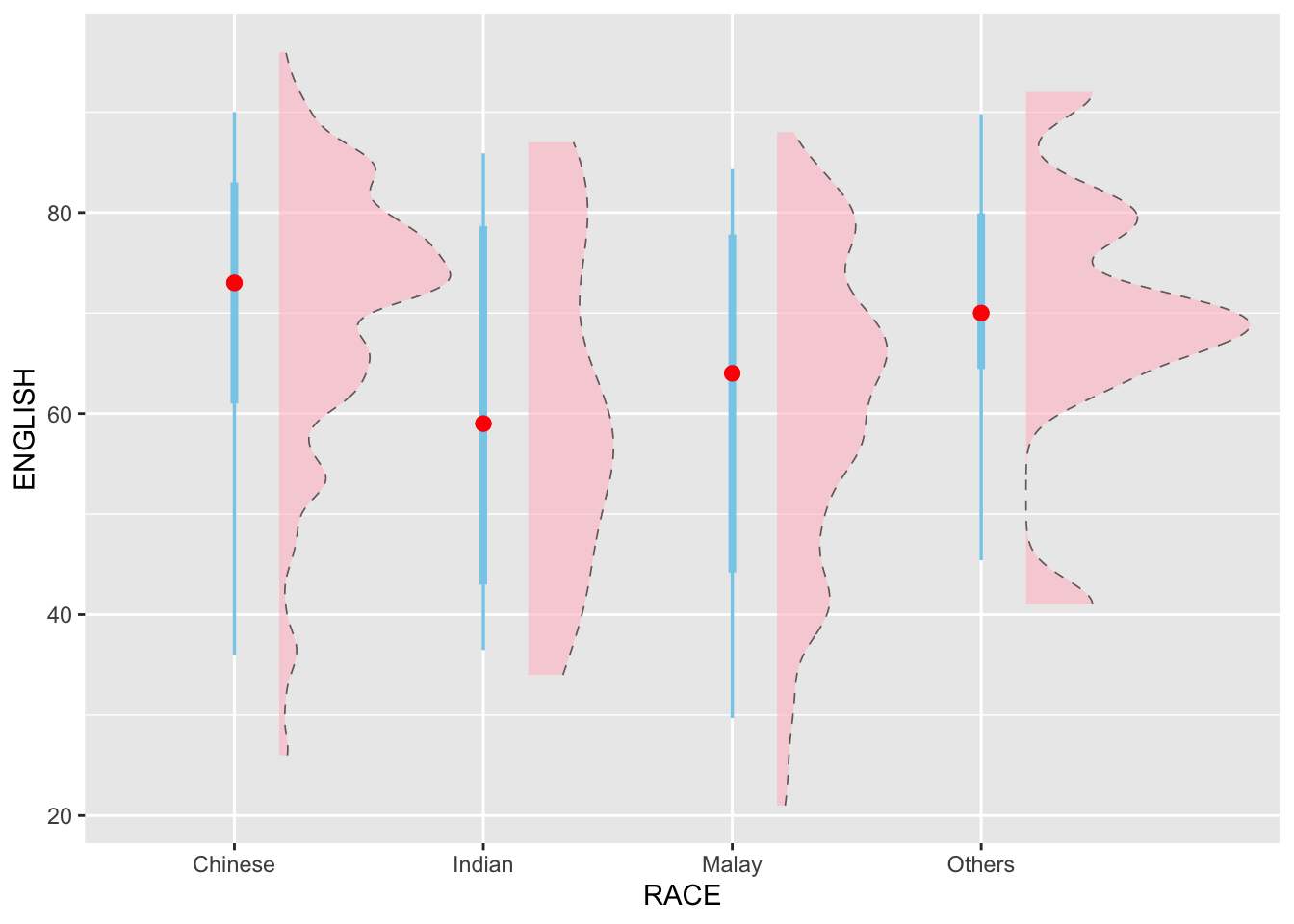
4.1 Plotting a half eye graph
First, we will plot a Half-Eye graph by using stat_halfeye() of ggdist package.
This produces a Half Eye visualisation, which contains a half-density and a slab-interval.
With slab interval; changed color for the slab & interval, points.
Show the code
ggplot(exam,
       aes(x = RACE,
           y = ENGLISH)) +
  stat_halfeye(adjust = 0.5,
               justification = -0.2,
               slab_color = "black",
               slab_fill = "pink",
               slab_linetype = "dashed",
               slab_linewidth = 0.3,
               slab_alpha = 0.6,
               interval_colour = "skyblue",
               point_fill = "yellow",
               point_colour = "red",
               point_size = 2
) 
Show the code
ggplot(exam,
       aes(x = RACE,
           y = ENGLISH)) +
  stat_halfeye(adjust = 0.5,
               justification = -0.2,
               .width = 0,
               point_colour = NA)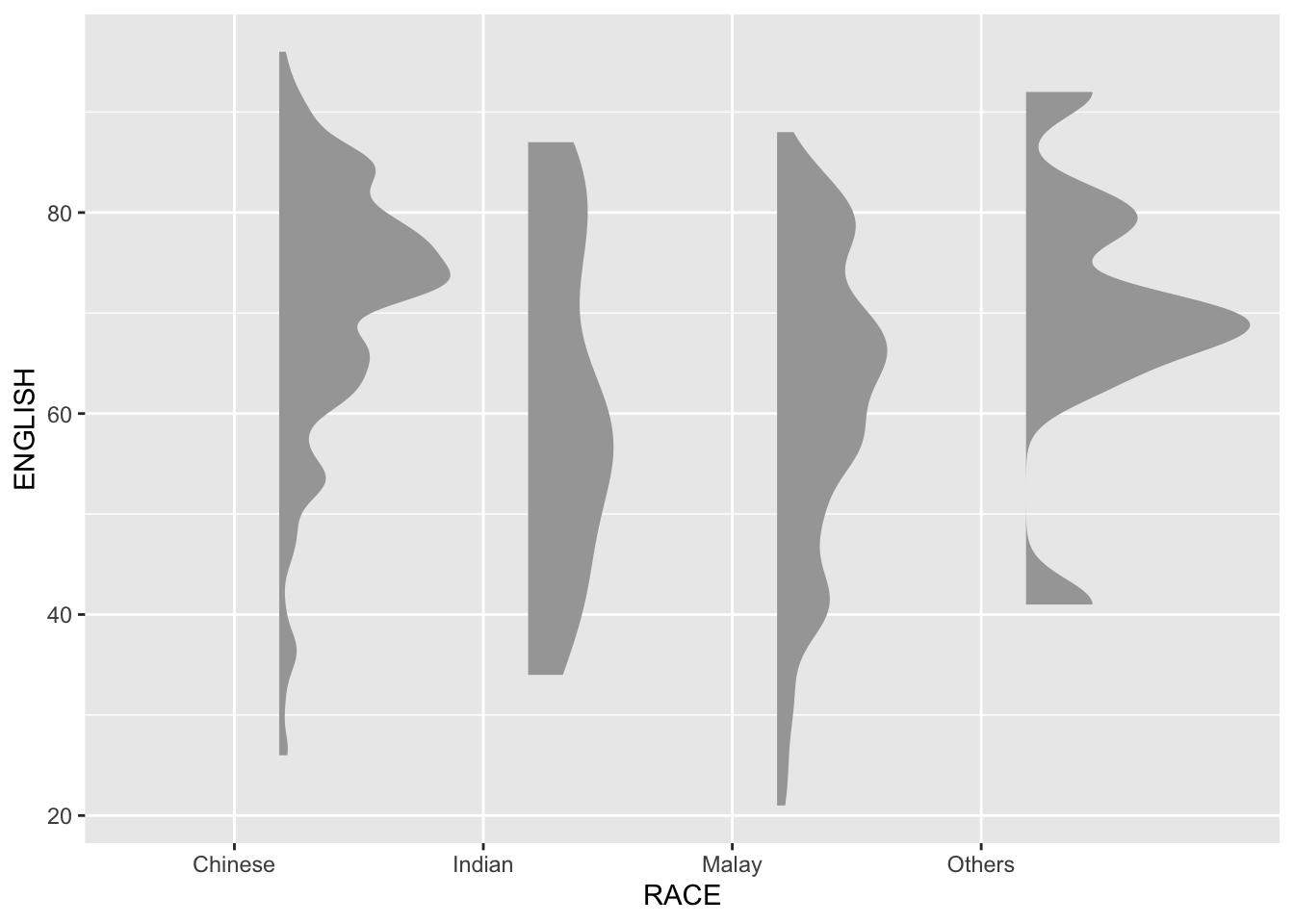
Things to learn from code above
We remove the slab interval by setting .width = 0 and point_colour = NA.
4.2 Adding boxplot with geom_boxplot()
Next, we will add the second geometry layer using geom_boxplot() of ggplot2. This produces a narrow boxplot. We reduce the width and adjust the opacity.
Changed slab colour, fill, linetype to dotline, slab alpha, and added color to the boxplot. Outliers are shown as well.
Show the code
ggplot(exam,
       aes(x = RACE,
           y = ENGLISH)) +
  stat_halfeye(adjust = 0.5,
               justification = -0.2,
               slab_color = "black",
               slab_fill = "pink",
               slab_linetype = "dashed",
               slab_linewidth = 0.3,
               slab_alpha = 0.4,
               .width = 0,
               point_colour = NA) +
  geom_boxplot(width = 0.2,
               col = "steelblue")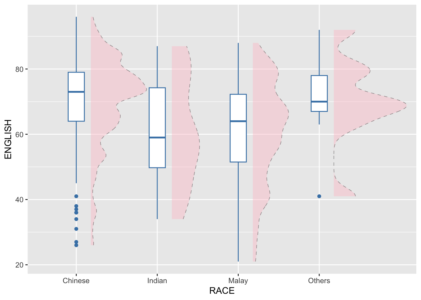
Show the code
ggplot(exam,
       aes(x = RACE,
           y = ENGLISH)) +
  stat_halfeye(adjust = 0.5,
               justification = -0.2,
               .width = 0,
               point_colour = NA) +
  geom_boxplot(width = 0.2,
               outlier.shape = NA)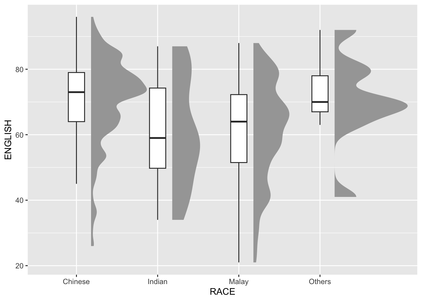
4.3 Adding dot plot with stat_dots
Next, we will add the third geometry layer using stat_dots() of ggdist package. This produces a half-dotplot, which is similar to a histogram that indicates the number of samples (number of dots) in each bin. We select side = "left" to indicate we want it on the left-hand side.
Changed stat_dots color by CLASS
Show the code
ggplot(exam,
       aes(x = RACE,
           y = ENGLISH)) +
  stat_halfeye(adjust = 0.5,
               justification = -0.2,
               slab_color = "black",
               slab_fill = "grey",
               slab_linetype = "dashed",
               slab_linewidth = 0.3,
               slab_alpha = 0.4,
               .width = 0,
               point_colour = NA) +
  geom_boxplot(width = 0.2,
               col = "grey",
               outlier.shape = NA) +
  stat_dots(side = "left",
            justification = 1.2,
            binwidth = .5,
            dotsize = 2,
            aes(color = CLASS))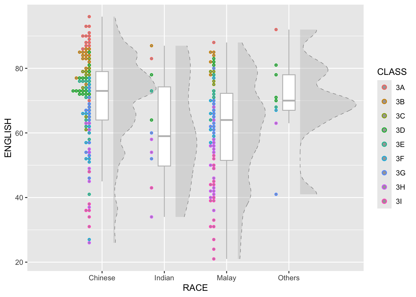
Show the code
ggplot(exam,
       aes(x = RACE,
           y = ENGLISH)) +
  stat_halfeye(adjust = 0.5,
               justification = -0.2,
               .width = 0,
               point_colour = NA) +
  geom_boxplot(width = 0.2,
               outlier.shape = NA) +
  stat_dots(side = "left",
            justification = 1.2,
            binwidth = .5,
            dotsize = 2)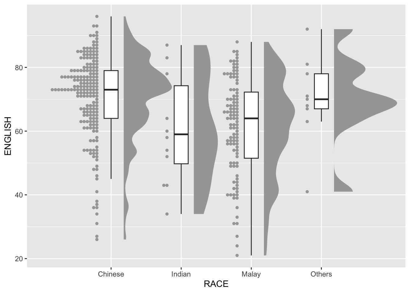
4.4 Finishing touch
Lastly, coord_flit() of ggplot2 package will be used to flip the raincloud chart horizontally to give it the raincloud appearance. At the same time, theme_economist() of ggthemes package is used to give the raincloud chart a professional publishing standard look.
Used a different theme theme_stata() and changed colours for the slab and dots.
Show the code
ggplot(exam,
       aes(x = RACE,
           y = ENGLISH)) +
  stat_halfeye(adjust = 0.5,
               justification = -0.2,
               slab_color = "grey",
               slab_fill = "#D6DED5",
               slab_linetype = "solid",
               slab_linewidth = 0.4,
               slab_alpha = 0.5,
               .width = 0,
               point_colour = NA) +
  geom_boxplot(width = 0.2,
               outlier.shape = NA) +
  stat_dots(side = "left",
            justification = 1.2,
            binwidth = .5,
            dotsize = 1.2,
            aes(color = CLASS)) +

  coord_flip() +
  theme_stata()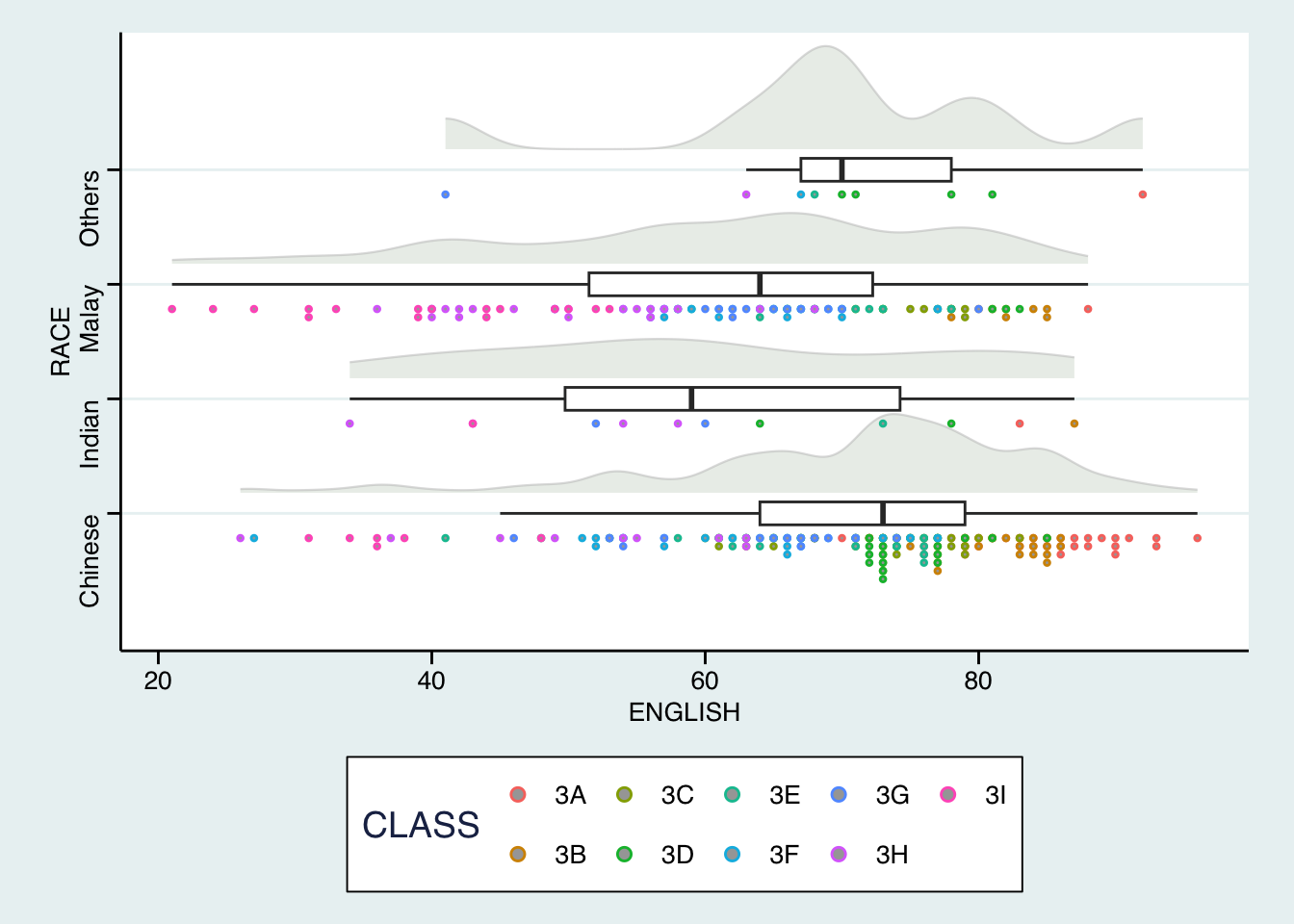
🎀️ Notice the there are fewer dots when using colours to display CLASS.
Show the code
ggplot(exam,
       aes(x = RACE,
           y = ENGLISH)) +
  stat_halfeye(adjust = 0.5,
               justification = -0.2,
               .width = 0,
               point_colour = NA) +
  geom_boxplot(width = 0.2,
               outlier.shape = NA) +
  stat_dots(side = "left",
            justification = 1.2,
            binwidth = .5,
            dotsize = 1.2) +
  coord_flip() +
  theme_stata()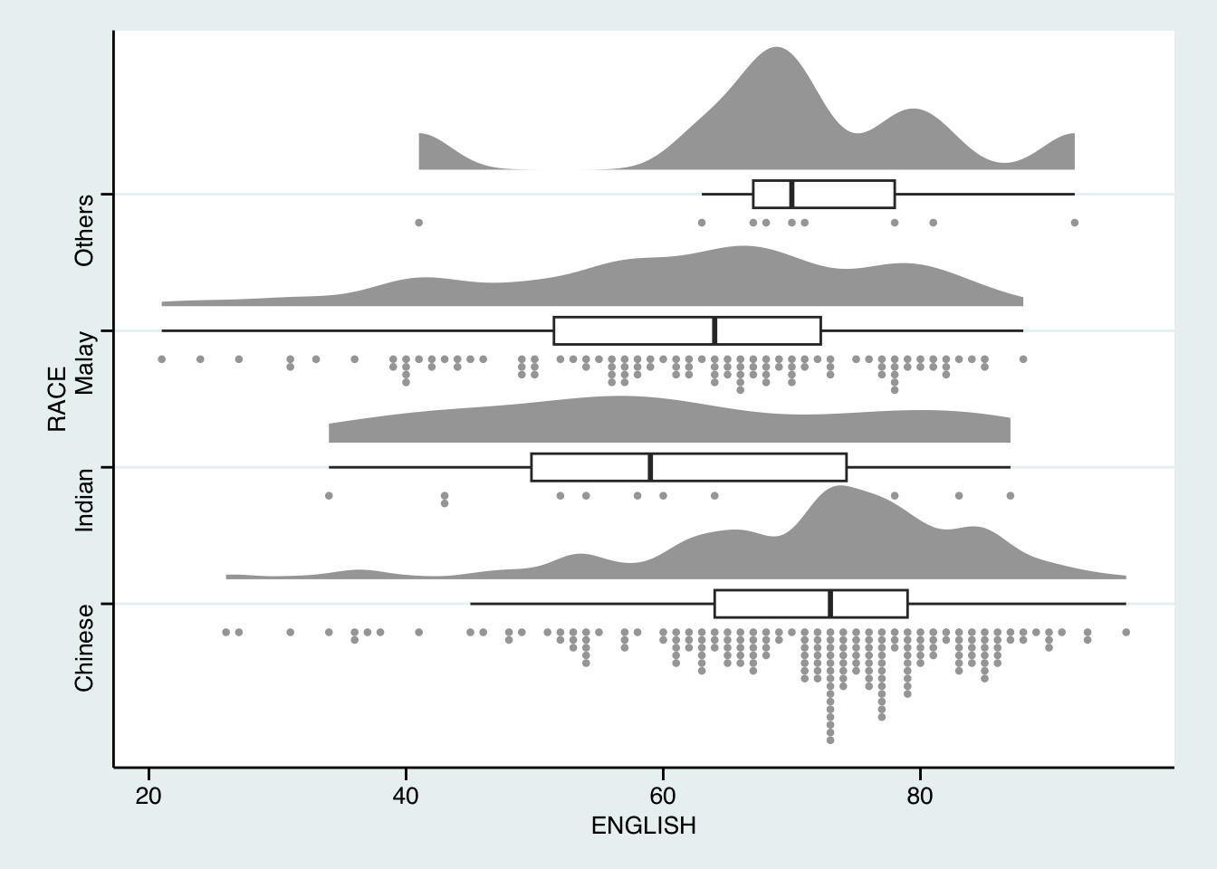
Show the code
ggplot(exam,
       aes(x = RACE,
           y = ENGLISH)) +
  stat_halfeye(adjust = 0.5,
               justification = -0.2,
               .width = 0,
               point_colour = NA) +
  geom_boxplot(width = 0.2,
               outlier.shape = NA) +
  stat_dots(side = "left",
            justification = 1.2,
            binwidth = .5,
            dotsize = 1.5) +
  coord_flip() +
  theme_economist()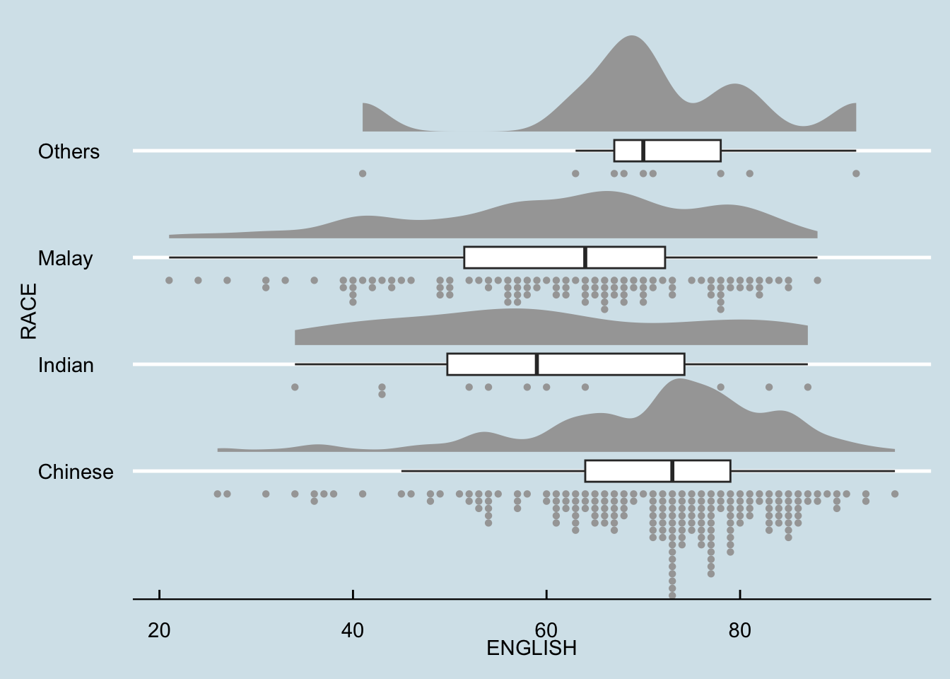
5 Reference
- Introducing Ridgeline Plots (formerly Joyplots)
- Claus O. Wilke Fundamentals of Data Visualization especially Chapter 6, 7, 8, 9 and 10.
- Allen M, Poggiali D, Whitaker K et al. “Raincloud plots: a multi-platform tool for robust data. visualization” [version 2; peer review: 2 approved]. Welcome Open Res 2021, pp. 4:63.
- Dots + interval stats and geoms
- Additional reference: Cedric Scherer Data Visualization & Info Disign [slides]