pacman::p_load(GGally, parallelPlot, tidyverse)Hands-on_Ex09_4 - Visual Multivariate Analysis with Parallel Coordinates Plot
1 Overview
Parallel coordinates plot is a data visualisation specially designed for visualising and analysing multivariate, numerical data. It is ideal for comparing multiple variables together and seeing the relationships between them. For example, parallel coordinates plot can be used to characterise clusters detected during customer segmentation.
2 Getting started
GGally, parcoords, parallelPlot and tidyverse packages will be used.
he World Happinees 2018 (http://worldhappiness.report/ed/2018/) data will be used. The data set is download at https://s3.amazonaws.com/happiness-report/2018/WHR2018Chapter2OnlineData.xls. The original data set is in Microsoft Excel format. It has been extracted and saved in csv file called WHData-2018.csv.
In the code chunk below, read_csv() of readr package is used to import WHData-2018.csv into R and save it into a tibble data frame object called wh.
wh <- read_csv("data/WHData-2018.csv")Have a look at the data.
head(wh)# A tibble: 6 × 12
Country Region `Happiness score` `Whisker-high` `Whisker-low` Dystopia
<chr> <chr> <dbl> <dbl> <dbl> <dbl>
1 Albania Centr… 4.59 4.70 4.48 1.46
2 Bosnia and Her… Centr… 5.13 5.22 5.04 1.88
3 Bulgaria Centr… 4.93 5.02 4.84 1.22
4 Croatia Centr… 5.32 5.40 5.24 1.77
5 Czech Republic Centr… 6.71 6.78 6.64 2.49
6 Estonia Centr… 5.74 5.82 5.66 1.46
# ℹ 6 more variables: `GDP per capita` <dbl>, `Social support` <dbl>,
# `Healthy life expectancy` <dbl>, `Freedom to make life choices` <dbl>,
# Generosity <dbl>, `Perceptions of corruption` <dbl>3 Plot Static Parallel Coordinates Plot
In this section, we will learn to plot static parallel coordinates plot by using ggparcoord() of GGally package.
3.1 Plot a simple parallel coordinates
Code chunk below shows a typical syntax used to plot a basic static parallel coordinates plot by using ggparcoord().
head(wh)# A tibble: 6 × 12
Country Region `Happiness score` `Whisker-high` `Whisker-low` Dystopia
<chr> <chr> <dbl> <dbl> <dbl> <dbl>
1 Albania Centr… 4.59 4.70 4.48 1.46
2 Bosnia and Her… Centr… 5.13 5.22 5.04 1.88
3 Bulgaria Centr… 4.93 5.02 4.84 1.22
4 Croatia Centr… 5.32 5.40 5.24 1.77
5 Czech Republic Centr… 6.71 6.78 6.64 2.49
6 Estonia Centr… 5.74 5.82 5.66 1.46
# ℹ 6 more variables: `GDP per capita` <dbl>, `Social support` <dbl>,
# `Healthy life expectancy` <dbl>, `Freedom to make life choices` <dbl>,
# Generosity <dbl>, `Perceptions of corruption` <dbl>Show the code
ggparcoord(data = wh,
           columns = c(7:12)) +
  labs(title = "Basic parellel plot") +
  geom_line(size = 0.01) +
  theme(
    plot.title = element_text(hjust = 0),
    axis.title.x = element_text(size = 0.7),
    axis.title.y = element_text(hjust=1, angle=0),
    plot.background = element_rect(fill = "#f1f4f5", color = "#f1f4f5"),
    legend.background = element_rect(fill="#f1f4f5"),
    panel.background = element_rect(fill="#f1f4f5"))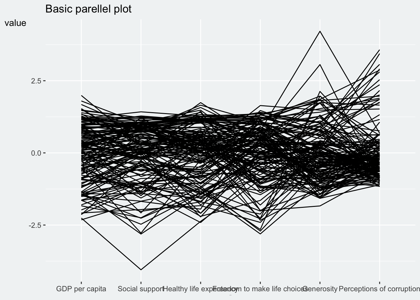
Notice that only two argument namely data and columns is used. Data argument is used to map the data object (i.e. wh) and columns is used to select the columns for preparing the parallel coordinates plot.
Use groupColumn() to group column ‘Region’:
Show the code
ggparcoord(data = wh,
           columns = c(7:12),
           groupColumn = "Region",
           scale = "robust") +
  labs(title = "Basic parellel plot grouped by Region") +
  geom_line(size = 0.01) +
  theme(
    plot.title = element_text(hjust = 0),
    axis.title.x = element_text(size = 0.7),
    axis.title.y = element_text(hjust=1, angle=0),
    plot.background = element_rect(fill = "#f1f4f5", color = "#f1f4f5"),
    legend.background = element_rect(fill="#f1f4f5"),
    panel.background = element_rect(fill="#f1f4f5"))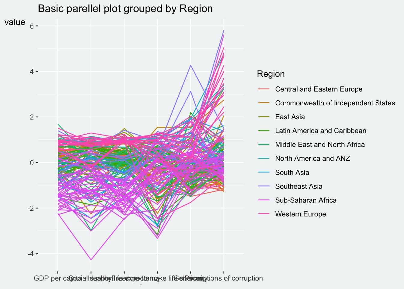
Can assign a color to specific group, but assigning the former columns may have the colors blocked by the rest.
Show the code
ggparcoord(data = wh,
           columns = c(7:12),
           groupColumn = "Region",
           scale = "robust") +
  labs(title = "Basic parellel plot grouped by Region with color") +
  geom_line(size = 0.01) +
  theme(
    plot.title = element_text(hjust = 0),
    axis.title.x = element_text(size = 0.7),
    axis.title.y = element_text(hjust=1, angle=0),
    plot.background = element_rect(fill = "#f1f4f5", color = "#f1f4f5"),
    legend.background = element_rect(fill="#f1f4f5"),
    legend.position = "left",
    panel.background = element_rect(fill="#f1f4f5")) +
  scale_x_discrete(guide = guide_axis(n.dodge = 2))+
  scale_color_manual(values=c("grey70", "grey70", "grey70", "grey70", "grey70", "grey70", "grey70", "grey70", "skyblue", "grey70") )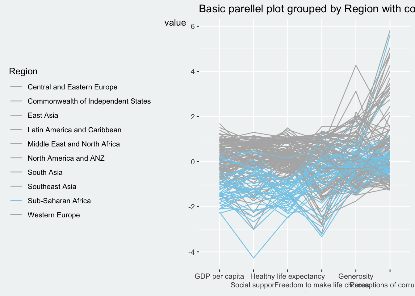
3.2 Plot a parallel coordinates with boxplot
It is hard to decipher the Parallel Coordinates Plot alone. We will complement it with boxplot. The arguments are provided in ggparcoord().
Show the code
ggparcoord(data = wh,
           columns = c(7:12),
           groupColumn = 2,
           scale = "uniminmax",
           alphaLines = 0.2,
           boxplot = TRUE,
           title = "Parallel Coordinates Plot of World Happines Variables") +
  theme(
    plot.title = element_text(hjust = 0),
    axis.title.x = element_text(size = 0.7),
    axis.title.y = element_text(hjust=1, angle=0),
    plot.background = element_rect(fill = "#f1f4f5", color = "#f1f4f5"),
    legend.background = element_rect(fill="#f1f4f5"),
    legend.position = "left",
    panel.background = element_rect(fill="#f1f4f5")) +
  scale_x_discrete(guide = guide_axis(n.dodge = 2))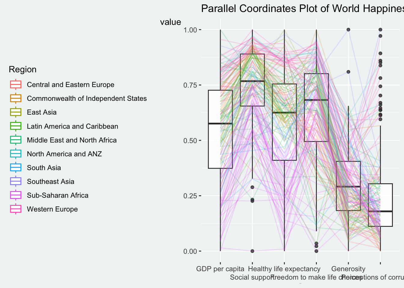
Learning from the code
groupColumnargument is used to group the observations (i.e. parallel lines) by using a single variable (i.e. Region) and colour the parallel coordinates lines by region name.scaleargument is used to scale the variables in the parallel coordinate plot by usinguniminmaxmethod. The method univariately scale each variable so the minimum of the variable is zero and the maximum is one.alphaLinesargument is used to reduce the intensity of the line colour to 0.2. The permissible value range is between 0 to 1.boxplotargument is used to turn on the boxplot by using logicalTRUE. The default isFALSE.titleargument is used to provide the parallel coordinates plot a title.
3.3 Parallel coordinates with facet
Since ggparcoord() is developed by extending ggplot2 package, we can combie some of the ggplot2 function when plotting a parallel coordinates plot.
In the code chunk below, facet_wrap() of ggplot2 is used to plot 10 small multiple parallel coordinates plots. Each plot represent one geographical region.
One of the aesthetic defect of the current design is that some of the variable names overlap on x-axis.
Show the code
ggparcoord(data = wh,
           columns = c(7:12),
           groupColumn = 2,
           scale = "uniminmax",
           alphaLines = 0.2,
           boxplot = TRUE,
           title = "Multiple Parallel Coordinates Plots of World Happines Variables by Region") +
  facet_wrap(~ Region) +
  theme(
    plot.title = element_text(hjust = 0, size = 8),
    axis.title.x = element_text(size = 0.2),
    axis.title.y = element_text(hjust=1, angle=0),
    axis.text.x = element_text(size = 6),
    plot.background = element_rect(fill = "#f1f4f5", color = "#f1f4f5"),
    legend.background = element_rect(fill="#f1f4f5"),
    legend.position = "bottom",
panel.background = element_rect(fill="#f1f4f5")) 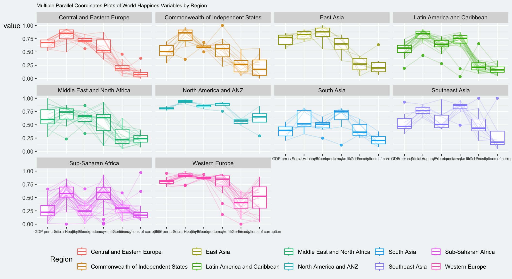
To make the x-axis text label easy to read, we will rotate the labels. We can rotate axis text labels using theme() function in ggplot2.
Show the code
ggparcoord(data = wh,
           columns = c(7:12),
           groupColumn = 2,
           scale = "uniminmax",
           alphaLines = 0.2,
           boxplot = TRUE,
           title = "Multiple Parallel Coordinates Plots of World Happines Variables by Region") +
  facet_wrap(~ Region) +
  theme(
    plot.title = element_text(hjust = 0, size = 8),
    axis.title.x = element_text(size = 10, hjust = 1),
    axis.title.y = element_text(hjust=1, angle=0),
    axis.text.x = element_text(size = 7, angle = 30),
    plot.background = element_rect(fill = "#f1f4f5", color = "#f1f4f5"),
    legend.background = element_rect(fill="#f1f4f5"),
    legend.position = "bottom",
panel.background = element_rect(fill="#f1f4f5")) 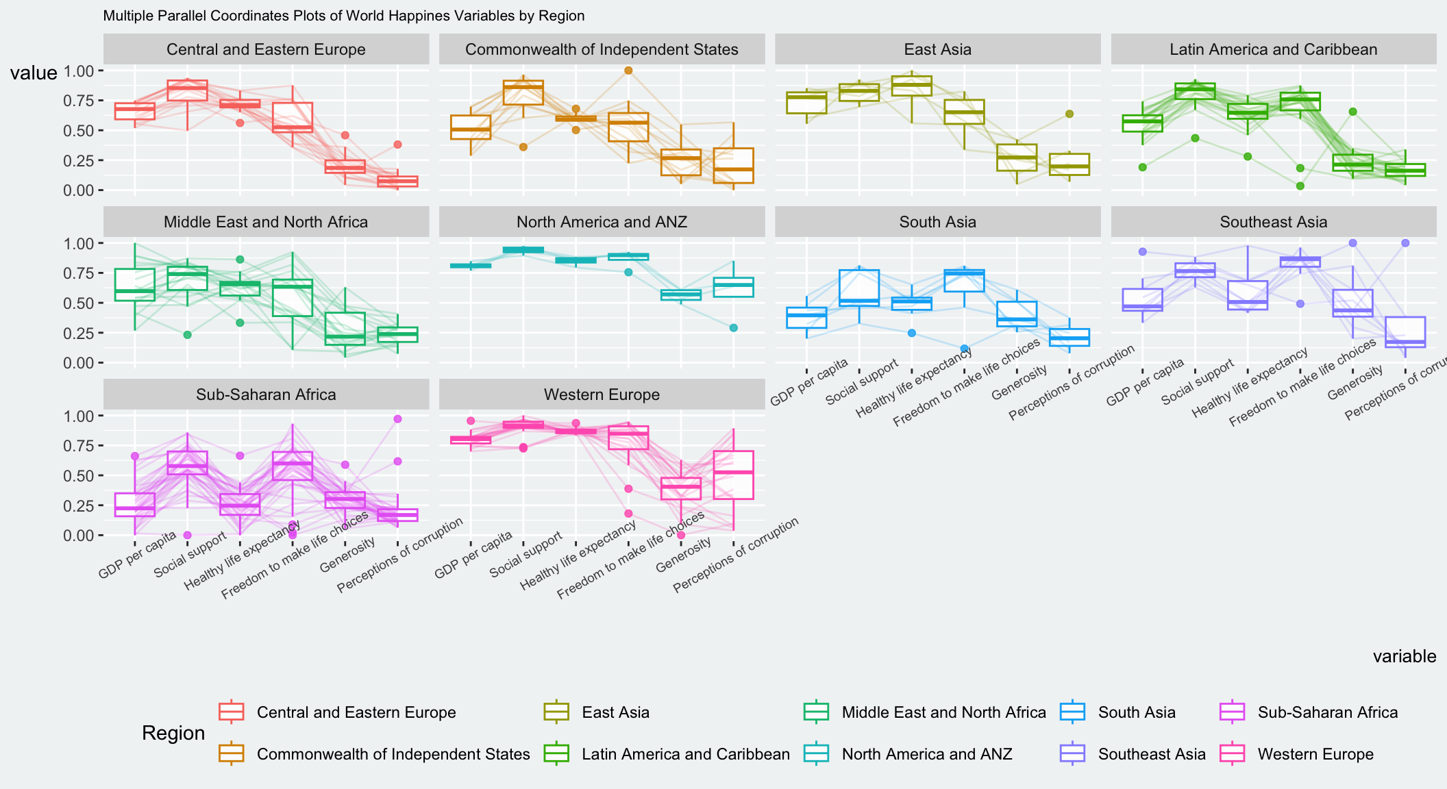
Learning from the code
- We use
axis.text.xas argument totheme()function. And we specifyelement_text(angle = 30)to rotate the x-axis text by an angle 30 degrees.
Some text labels after rotation are overlapping the plot. We can use hjust to adjust the position of the labels in theme().
Show the code
ggparcoord(data = wh,
           columns = c(7:12),
           groupColumn = 2,
           scale = "uniminmax",
           alphaLines = 0.2,
           boxplot = TRUE,
           title = "Multiple Parallel Coordinates Plots of World Happines Variables by Region") +
  facet_wrap(~ Region) +
  theme(
    plot.title = element_text(hjust = 0, size = 8),
    axis.title.x = element_text(size = 10, hjust = 1),
    axis.title.y = element_text(hjust=1, angle=0),
    axis.text.x = element_text(size = 7, angle = 30, hjust = 1.1),
    plot.background = element_rect(fill = "#f1f4f5", color = "#f1f4f5"),
    legend.background = element_rect(fill="#f1f4f5"),
    legend.position = "bottom",
panel.background = element_rect(fill="#f1f4f5")) 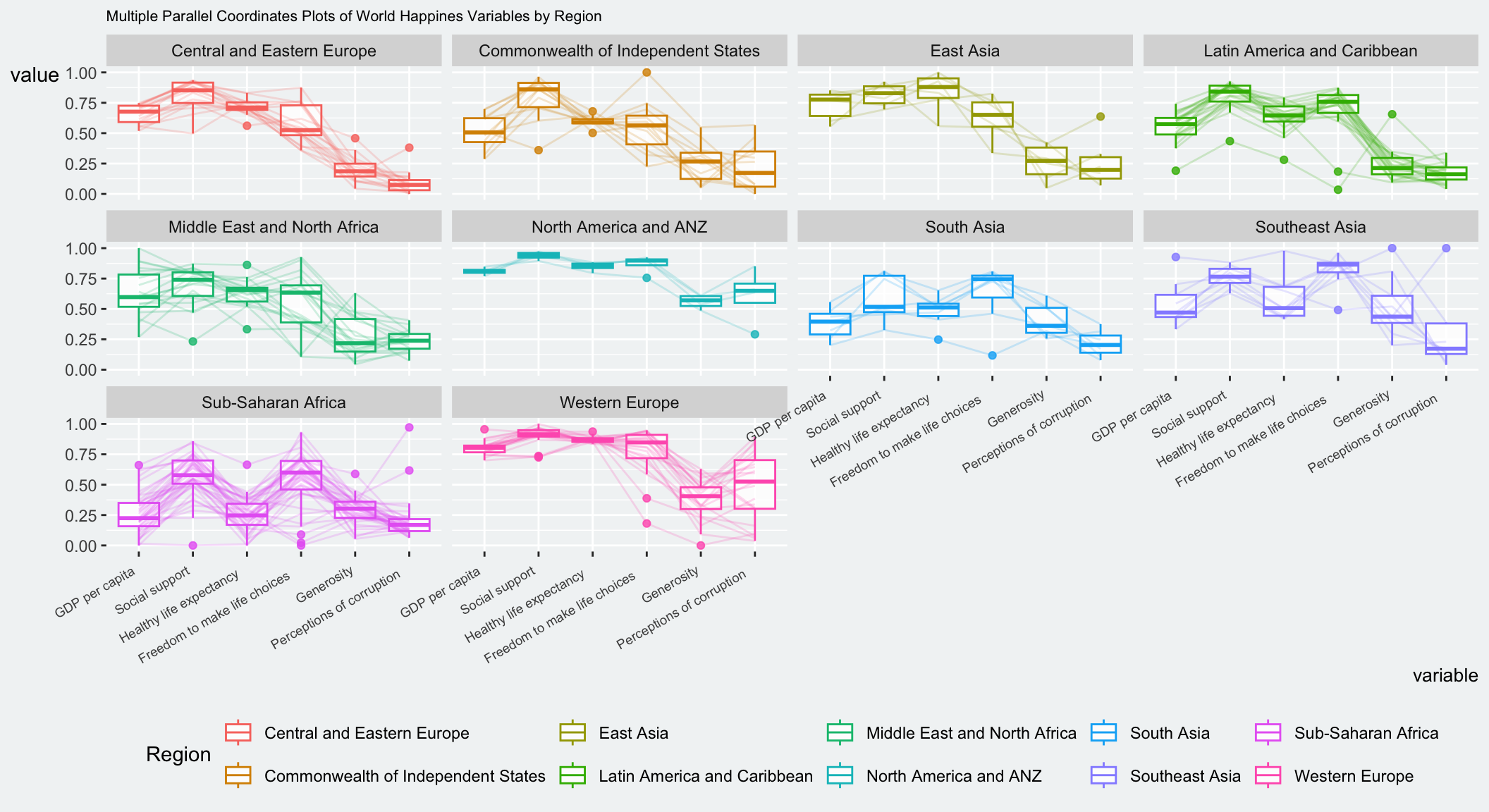
4 Plot Interactive Parallel Coordinates Plot: ParallelPlot methods
parallelPlot is an R package specially designed to plot a parallel coordinates plot by using ‘htmlwidgets’ package and d3.js. We will learn how to use functions provided in parallelPlot package to build interactive parallel coordinates plot.
The code chunk below plot an interactive parallel coordinates plot by using parallelPlot().
Note that some labels are long and overlapping.
Show the code
wh <- wh %>%
  select("Happiness score", c(7:12))
parallelPlot(wh,
             width = 320,
             height = 250)
To solve the issue in the basee plot, we use rotateTitle argument is used to avoid overlapping axis labels.
Show the code
parallelPlot(wh,
             rotateTitle = TRUE)
Color can be customised using continuousCS.
parallelPlot(wh,
             continuousCS = "YlOrRd",
             rotateTitle = TRUE)
histoVisibility argument is used to plot histogram along the axis of each variables.
histoVisibility <- rep(TRUE, ncol(wh))
parallelPlot(wh,
             rotateTitle = TRUE,
             histoVisibility = histoVisibility)
When clicking on a variable, the lines often change colour based on how that variable scales or groups the data.